CASE STUDY
Crezca
A reflective practice tool for painters. Built to turn progress into understanding.
ROLE
Designer
TIMELINE
3 Weeks
YEAR
2026

OVERVIEW

Another progress picture added to the void of my camera roll
THE PROBLEM
After finishing a painting, I couldn't clearly see how it had evolved or recall what I had noticed along the way. The insights were there but had nowhere to live.


My camera roll. Somewhere in here is six months of work.
THE OPPORTUNITY
My own pain points led me to address:
01
Camera roll chaos
Progress shots buried with no structure. Impossible to find and harder to compare.
02
Comparison is frustrating
Inconsistent framing makes it nearly impossible to see what actually changed between sessions.
03
Value checking breaks flow
Applying a B&W filter every time you want to check values means leaving the painting mentally.
04
Reflection is never captured
Observations made while painting vanish the moment the brush goes down.
Which led me to ask…
How might we help artists see what’s changing in their work—and create space to reflect on those changes while they’re still happening?
THE BREAKDOWN
01
CUT: AI insights from the comparison screen
Early explorations included AI-generated insights that described what changed between milestones. But the app's premise is that artists learn by observing themselves. AI-generated insights take that observation away from them.
What replaced it: a rotating prompt and a free text area. The artist does the noticing.

Before

After
02
CUT: Gallery grid view
A gallery grid view was an early direction for browsing milestones. It looks clean and scans well, but it flattens every milestone into an equal-weight object. Milestones have a sequence. Removing the grid meant the timeline became the only way to read the work, which is the right way to read it.

Before

After
03
CUT: Reflection as a separate top-level tab
An early exploration made reflection a top-level destination — somewhere you'd navigate to in order to reflect. The problem was context. Reflection now happens on the milestone itself, next to the painting that prompted the thought. The Reflections tab is where those notes collect, so your thinking accumulates into something you can actually read back.

Before

After
A focused, studio-like tool that makes documenting process feel worth doing.
FLOW 1
Creating a project
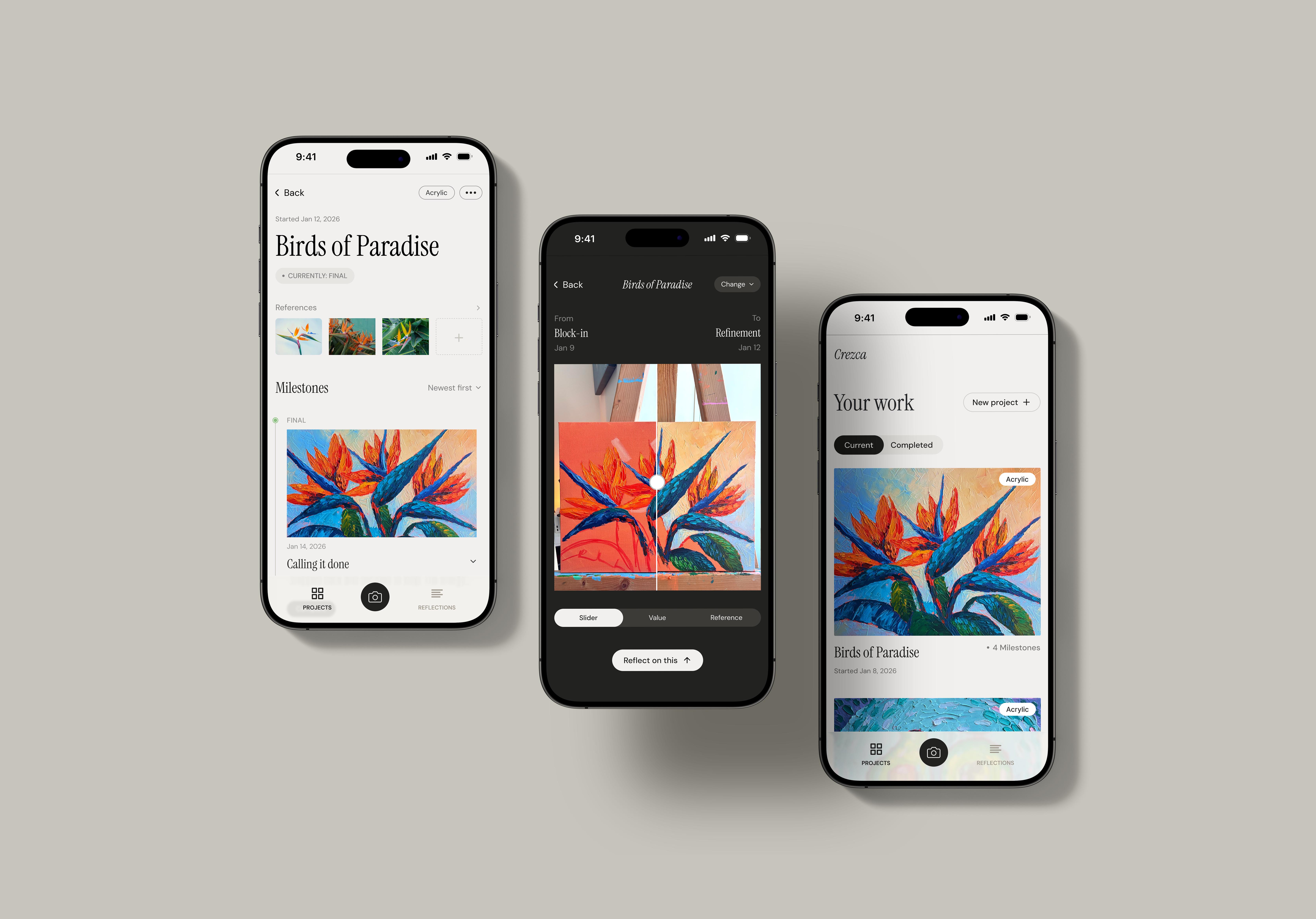
Capturing the first milestone during onboarding means the user leaves with something real, not an empty project waiting to be filled. Three steps: name it, pick a medium, take the photo.

FLOW 2
Capturing a milestone
Painters check values by squinting. Crezca does it for them — live grayscale on the viewfinder, before the shot. Capture, name it, pick a stage. Each photo becomes a fixed point in the story of the painting.

FLOW 1
Comparing and reflecting
The screen goes dark so the painting takes over. After seeing two moments side by side, a single nudge opens a prompt. Whatever the artist notices gets saved permanently to that moment in their process.


OUTCOME
Every painting becomes a record of growth, not just an image in a camera roll. Artists can finally look back, compare, and actually learn from their work.
REFLECTION
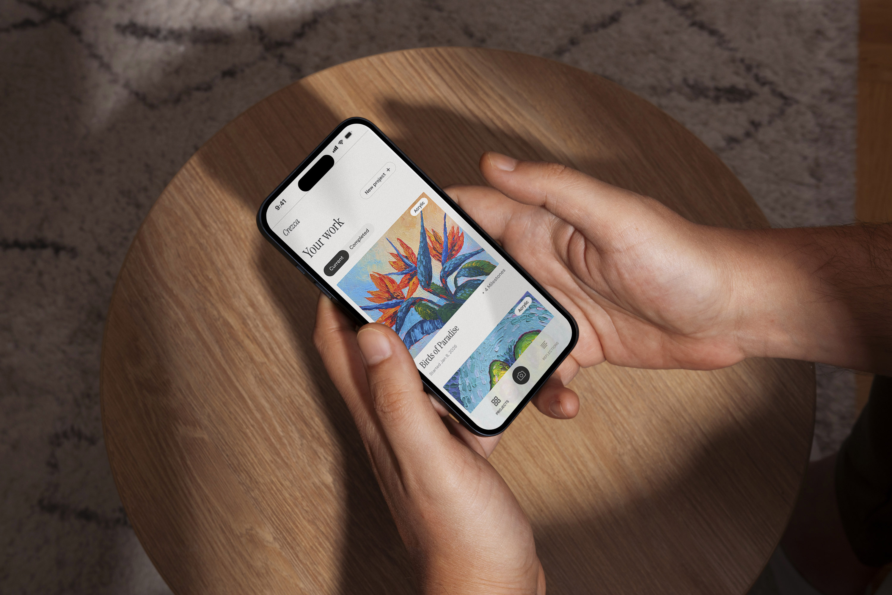
This project taught me that restraint is a design skill. The strongest version of Crezca came from understanding what deserved to stay.
The paintings throughout this app are my own. What started as a personal frustration became an exploration of how artists document, reflect on, and learn from their creative process. Designing Crezca reminded me that intentional products are shaped not only by what they include, but by what they choose to leave out.